Tendd
A money app for people who avoid money apps. It never shows a number without handing you something to do about it.
- My role
- Product design end to end: strategy, jobs, journey, architecture, prototype, voice, concept, design system, responsive, motion
- Primary user
- Emma, the anxious non-looker: avoids her finances on purpose
- Built
- 17 screens, 55 pages, every state as its own page, then the whole set again in colour
- Stage
- 11 of 12 stages complete, through Responsive and motion
The people who need this product are the people avoiding it.
Subscription creep is not an information problem. Almost everyone knows, roughly, that too much is leaving their account every month. They do not look because looking feels bad, and every product in the category opens by making it feel worse: connect your bank account first, then here is your total.
The target user is not a spreadsheet person waiting for better analytics. She is someone who has decided, reasonably, that not looking is cheaper than the anxiety of looking. Any design that begins with a demand and ends with a number loses her in the first thirty seconds.
I mapped the retreat before designing the entrance.
I drew the current journey honestly, in five phases: baseline avoidance, the trigger that makes her act, the attempt, the friction pit, and the retreat back to avoidance. Every emotion in that map carries a research source or an explicit [?], so nobody downstream can mistake my assumption for a finding.
The pit is phase four, and it is made of three specific things stacked on top of each other: cryptic statement codes she cannot map to real services, a bank connection demanded before any value has been shown, and the overwhelm of a full list arriving at once. Each one is survivable alone. Together they end the session.
Design the second minute first. That is where the product is lost.
The Guided Reveal: pace the truth, and pair it with an action.
The whole product turns on one decision. The total is never the opening move. It arrives last, after two smaller steps that let her get her footing, and it never arrives alone: the number and the thing she can do about it appear in the same breath.
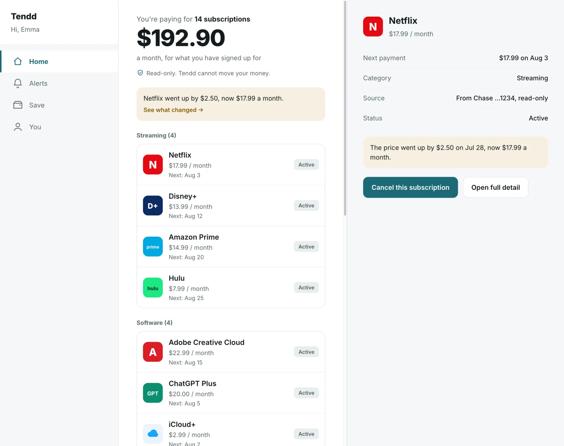
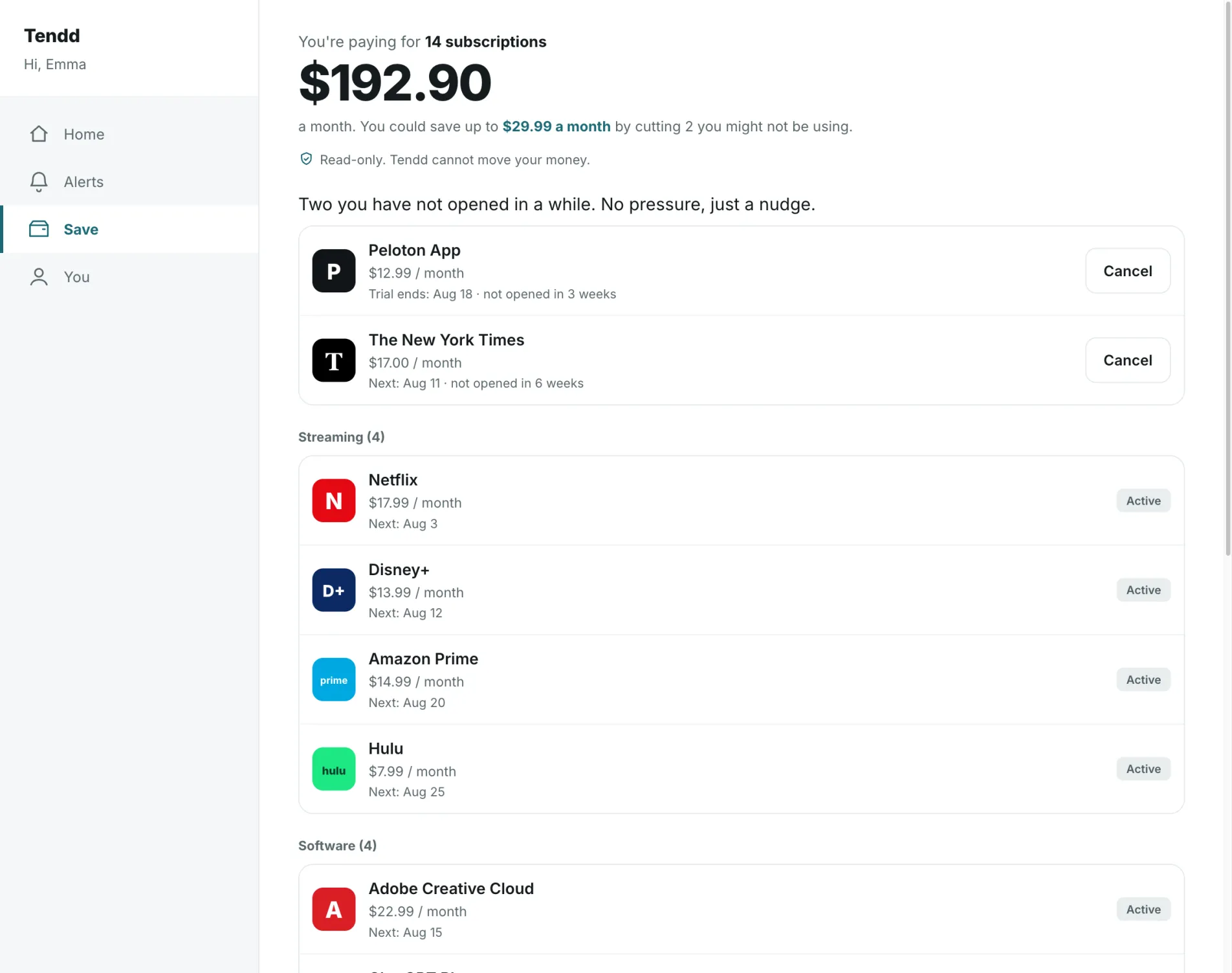
Count first, because a count is neutral. Then categories with recognisable logos, because that is what fixes the cryptic-code problem: she is not decoding a statement, she is recognising services she already knows. Only then the total, paired with a first suggested cancellation. The same information, in an order she can stay in the room for.
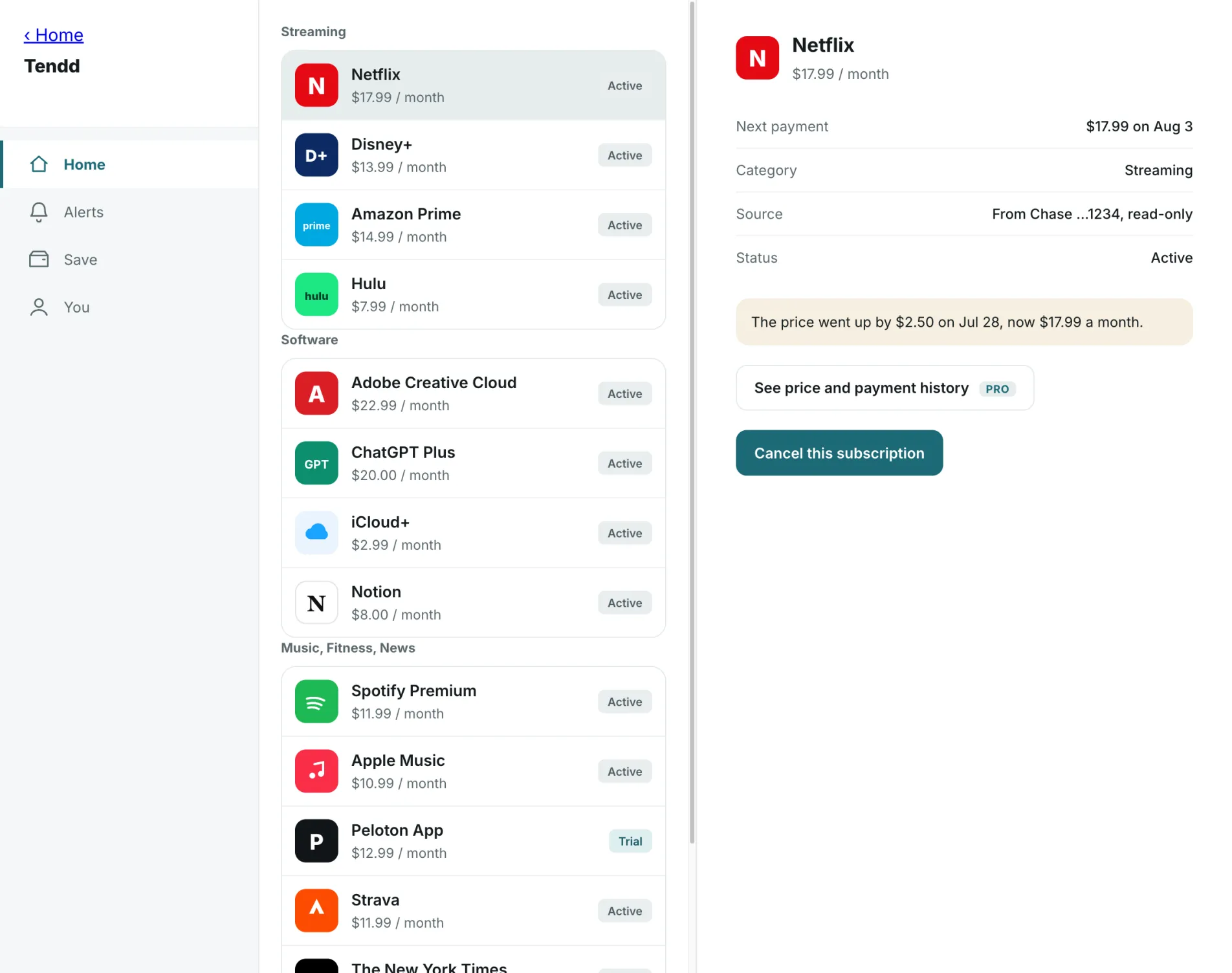
The reveal, as the product renders it.
Three frames from the deployed files. The colour language is no longer a sample: every screen and every state exists in it, drawn from a component kit rather than painted one file at a time, and the grey prototype stays underneath as the structural source of truth.
Five locked calls. One of them costs revenue on purpose.
Gradual reveal, with every number paired to an action.
Count, then categories, then total plus a first move. This is the product, not a nicety of onboarding, so it is locked at the architecture level and every downstream screen inherits it.
A full manual path, so the bank is never a gate.
Manual entry with presets ships at launch alongside the bank connection. A user who does not trust an aggregator with her accounts still gets the entire product. Privacy is a supported path, not a downgraded one.
The paywall never stands between a person and cancelling.
History, trends and advanced alerts are paid. The cancel guide and the moment of killing a subscription are free, forever. Monetising the exact instant someone is trying to save money would have worked, briefly, and would have made the product the thing it was built against.
One market first, properly.
US bank coverage first, EU deferred with the reason written down. A subscription tracker that half-recognises a user's providers is worse than one that does not serve her country yet.
One intentional orphan screen, kept and justified.
The upgrade screen is the only node in the architecture that no user job asks for. It stays, labelled as a decision-justified commercial gate, so the traceability matrix stays honest rather than tidy.
The one question design cannot answer.
[?] Does an avoider actually look, and does she feel calmer afterwards. Everything else in this project rests on that single assumption. It is carried explicitly through the journey map to the endpoint, it is not hidden inside an optimistic emotional curve, and it is only closable in a prototype test with people who genuinely avoid their finances. Not with people who like budgeting apps.
The real files, including the visual language.
Tendd is the furthest along of the three. It is through the concept stage and out the other side: the visual language is a working design system, every screen exists in colour, and the width, motion and rollout decisions are written down next to the structural work rather than left as taste.
Brio