Yonder
Prediction markets are built like trading floors. Yonder is designed for people who follow the news and want a stake in it, without learning an order book first.
- The problem
- The leading prediction markets feel like trading terminals: order books, jargon, a wallet before anything else. The people who follow events most closely arrive believing “this looks like crypto, so it's a scam”, and the first loss ends them.
- The goal
- Take a news follower from an event to a confirmed first bet with no wallet up front. The test signal is first-bet completion from cold traffic: below 10 percent means the barrier is motivation, not friction.
- What I did
- All twelve stages: research, personas, journeys, architecture, 119 grey screens, voice, concept, 119 painted screens, 49 components, a 61-page system, responsive, motion and a handoff.
- What it gave
- A complete design package, public: every screen and every state its own page, and a handoff that two readers with no context each used to build a feature from the documentation alone.
The audience with the opinions is the one the product scares off.
A prediction market lets you buy YES or NO on a real event. The people who would use one most are not traders; they are the people who follow politics, crypto and culture closely and have a view. They are met by order books, leverage and a wallet prompt, and the fear the research documents most is simple: this looks like crypto, so it is a scam.
On a trust benchmark scored out of 40, the closest structural competitor scores 14. The sports betting app the same audience already uses scores 33. That gap of 19 points is what the design has to close, without a licence to lean on.
Explain the number, and ask for money last.
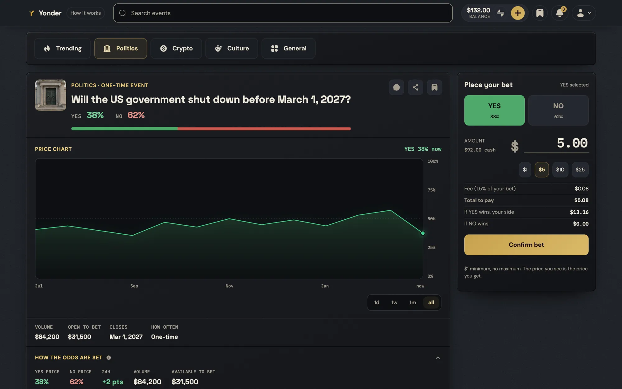
The first screen is live events, not a sign-up. The order is event, then mechanics, then bet, never the reverse, and the crypto gate fires at Confirm, not at the door, so a person can browse and form a bet with no wallet at all.
The payout model was changed so it could be said in one sentence: you buy at the price on screen, the price is locked when you confirm, and a winning share pays one dollar. The earlier model, a payout that depended on when the bet was placed, could not be explained to a newcomer, so it went.
Design the loss. Mark the win without lighting a fuse.
A spectator's clarity, not a trader's terminal.
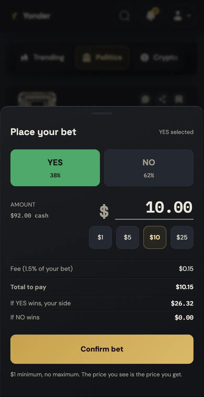
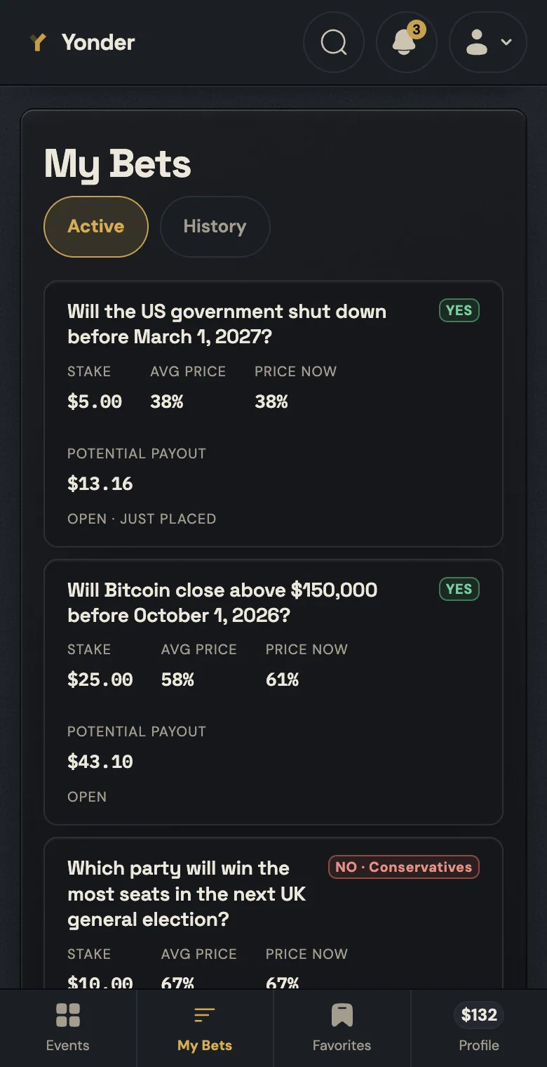
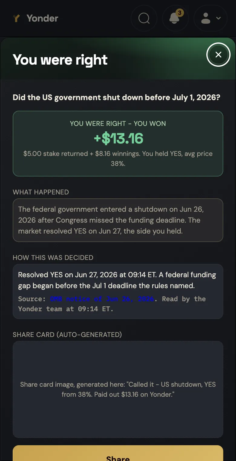
About 25 events are open at once, curated, a number decided so the whole navigation model could be settled: at 25 a person can scan the feed and search is a convenience; at 250 search would be the only way in. The profile is a prediction record, read as reputation. Notifications are about events, never about topping up a balance.
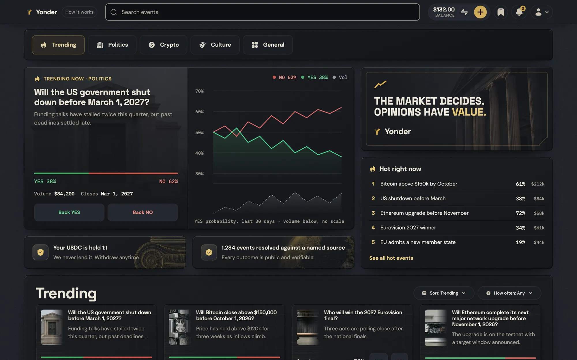
Four calls, and what each one cost.
The wallet is asked for at Confirm, not at entry.
Everything before the bet works without an account. Trust is built by the product, not demanded by a sign-up wall.
CostMore anonymous traffic that never converts.
Shares at a locked price. A winning share pays $1.
The same model the category leaders use, chosen because it is the only one that fits in one sentence a newcomer follows.
CostNo room for novel pricing mechanics.
A curated feed of about 25 events.
The number settled search, paging and the category rail in one decision.
CostLess breadth than markets with thousands of events.
No casino shine.
Energy from contrast and one loud accent, never from confetti or a wall of green and red buttons. The brand is credible and calm.
CostLess of the dopamine the category runs on.
A finished design, and the two numbers that would prove it.
Shipped
Built to move
Public, from research to handoff.
Dragon